Jupiter NEXT


| Typology | Hospitality |
| Client | Jupiter Hotel |
| Location | Portland, OR |
| Date | 2018 |
| Status | Completed |
| Total SF | 41,355 |
Origin
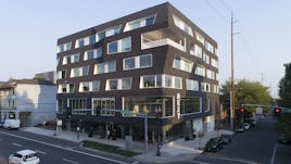
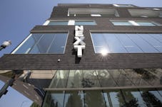
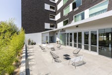
The owners of a renowned hotel in Portland Oregon approached our firm, asking us to design an extension to their existing facilities: adding 67 hotel units on 42,000sf. Our main objective, and the ultimate design solution was to use the conventional program and standard architectural expression as a jumping off point to create a building that will be worthy of the Jupiter brand. The client is progressive, embraces innovation, and through a collaborative effort, we identified a program to challenge the way things are usually done, utilizing building materials and details that reflect this concept. With an origin of a standard gridded, punched window façade – the building mass is first lifted from the ground plane to create a free flowing public realm.
Distortion and Site Context
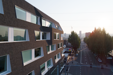
The design solution is a traditional L shaped hotel building, with accentuation of the common spaces and event spaces, which lead to distortions of the facade shape. The building has 3 major gathering spaces: the lobby, the 2nd floor event space, and a 5th floor party deck. The highly regular punch window façade is allowed to stretch and distort the skin of the building where these large gathering space push against limits of the site.
The site itself is located along E Burnside Street which is a historic arcade district and completely unique in Portland. The street was widened in the 60’s and created a series of arcaded structures from the carving away of the ground floor space that was given back to the public realm.The distortion of the façade is not only expressive of the program elements within the building but also sites itself along this significant street as a modern interpretation of the historic arcades.
A material statement
The program required a siding material that can flexibly bend over the unconventional shape, without losing the inherent structural integrity of the building. Inspired by rubber latex that stretches over a form, we found vertically installed black asphalt shingles were the most aesthetically pleasing, and the most cost effective solution. It is an adaptation that resonates with the innovative design of the building. The roofing shingles can easily be installed and bent around corners and warp with the facade. The manufacturer of the product is a local company founded in 1954, and their products are sold nationwide. This company consistently values innovation, and advocates for environmentally, and economically responsible values. Methane sourced from a nearby wastewater treatment plant makes up, on average, 68% of their manufacturing power; an unusual way of doing things that aided our decision to collaborate with this innovative company.
Team
| Architect | Carrie Strickland, Bill Neburka, Jennifer Dzienis, Ian Roll, Kegan Flanderka, Reed Webster |
| General Contractor | Yorke and Curtis |
| Structural Engineer | DCI Engineers |
| Geotechnical Engineer | GRI |
| Shingles | Malarkey |
| Photography | Christopher Dibble Photography |